Mixing orange and blue can create an impressive burnt sienna tone, whether you’re working with digital tools, traditional paint, or photography. Below, we’ll break down how to achieve this color combination in various artistic fields.
1. Graphic Design
In graphic design, you can mix orange and blue by adjusting hue, saturation, and brightness using tools like Adobe Photoshop or Illustrator. If you’re aiming for consistent results, use pre-mixed burnt sienna swatches or color codes to maintain uniformity across your project.
2. Painting
For traditional painters, mixing burnt sienna with physical paint requires experimenting with different ratios of orange and blue. Begin by adding small amounts of orange to blue (or vice versa) on your palette, gradually adjusting the blend to achieve the tone you desire. This process allows for endless variations, which is ideal for creating custom colors that match your artistic vision.
3. Photography
In photography, burnt sienna can be achieved through post-processing. Using programs like Adobe Lightroom or Photoshop, you can manipulate the color temperature and saturation of blue and orange to create warmer tones in your image. Filters and gels can also be used during the shoot to naturally introduce this warm, reddish-brown color into your photos.
Digital Painting Example:
In digital painting, achieving the right color balance between orange and blue often requires switching between foreground and background colors. To streamline this process, digital artists can use tools like Azilian LifeMotion to customize brush sizes and adjust colors with ease, improving both accuracy and workflow.
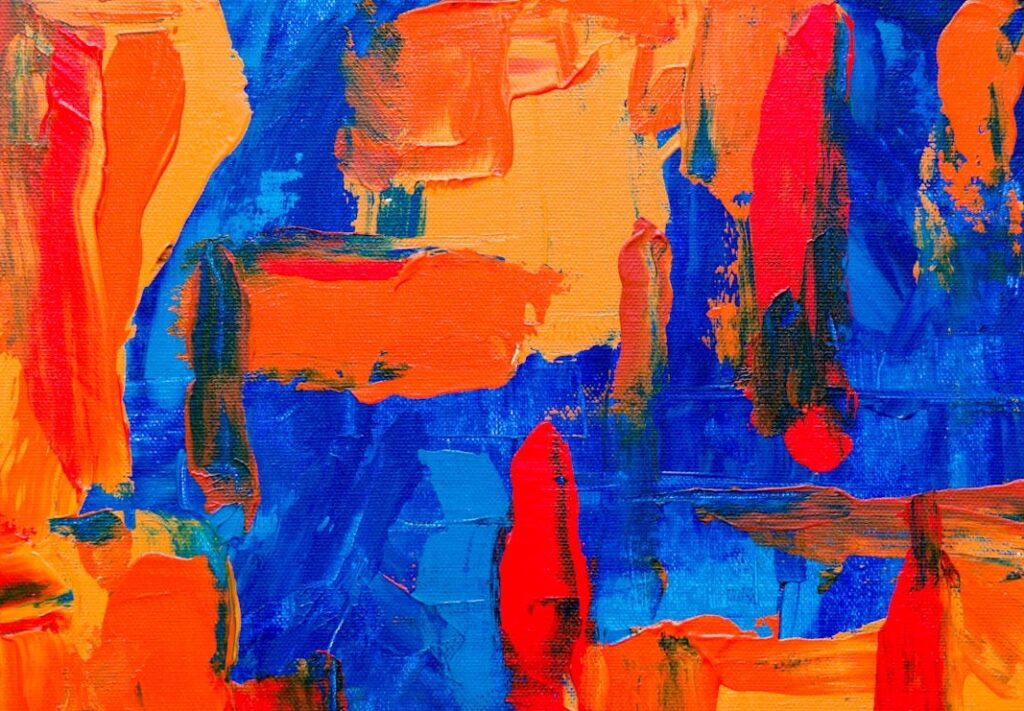
Is Mixing Orange and Blue a Good Color Combination?
Now that we know mixing blue and orange results in burnt sienna, let’s discuss whether this is a good color choice for your creative projects.
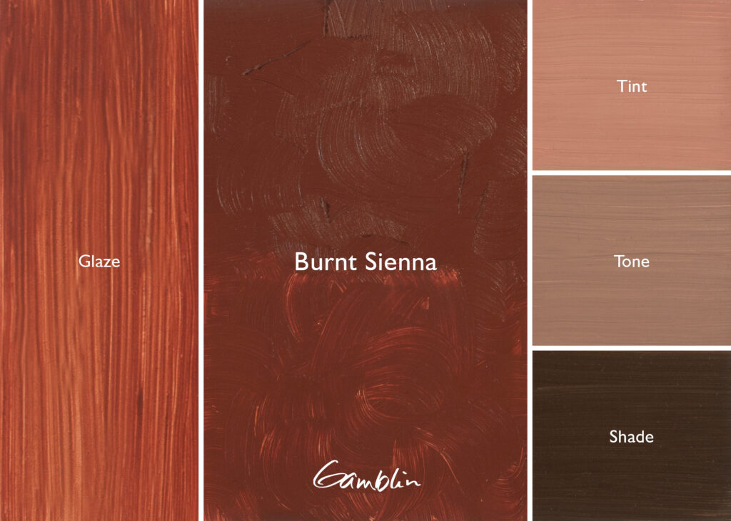
1. Emotional Impact of Burnt Sienna
Burnt sienna is a warm, earthy color that evokes feelings of stability, comfort, and warmth. This makes it an excellent choice for projects that aim to convey groundedness or a sense of coziness. It’s a popular option in interior design, fashion, and even fine art, where its vintage, rustic appeal can create a timeless look.
2. Contrast and Mood
The complementary nature of blue and orange (since they sit opposite each other on the color wheel) means they can create striking visual contrasts. For example, using blue as a primary color with burnt sienna accents can make the composition pop. On the other hand, using burnt sienna as the dominant color, with touches of blue for contrast, produces a bold, dynamic look.

3. Creating Different Effects
The exact shade of burnt sienna you achieve will depend on the ratio of orange to blue. A darker shade, created with more blue, can produce a deeper, more mysterious tone. A lighter burnt sienna, formed by adding more orange, may give your design a warmer, more inviting feel.
How to Use Blue and Orange in Your Designs
Here are some practical tips for incorporating blue and orange (or burnt sienna) into your creative work:
1. Balance Your Color Palette
Balance is key when working with strong color contrasts like blue and orange. Too much of either color can overwhelm the viewer, so aim for moderation. Use one color as the dominant tone and the other as an accent to add depth and visual interest.
2. Experiment with Shades
Experimenting with different shades of blue and orange will help you achieve the perfect tone for your project. Whether you’re working digitally or with physical paints, explore the variety of hues burnt sienna offers to find the one that fits your vision.
3. Enhance Workflow with Azilian LifeMotion
If you frequently work in digital painting or graphic design, you can optimize your workflow with Azilian LifeMotion. This tool simplifies the creative process by allowing you to seamlessly adjust brush sizes, switch between colors, and fine-tune your work without unnecessary interruptions.
Final Thoughts on Mixing Orange and Blue
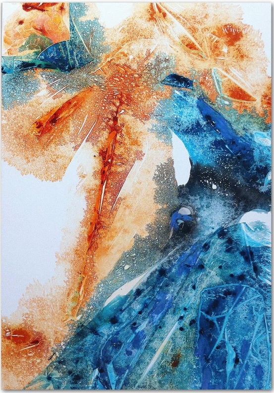
So, what color does orange and blue make? The answer is the warm, reddish-brown hue of burnt sienna. This versatile color can enhance any project, from paintings and graphic designs to interior decor. The magic of burnt sienna lies in its ability to evoke emotions of warmth and stability while creating striking contrasts with complementary colors like blue.
When experimenting with color combinations, don’t forget to maintain balance and adjust tones based on your project’s needs. And for digital artists, using tools like Azilian LifeMotion can help simplify the process, ensuring you stay in creative flow while achieving the perfect color mix.
Whether you’re a designer, painter, or photographer, burnt sienna offers endless creative potential—so go ahead, experiment, and bring this dynamic combination to life in your next project!

