Lavender is a color that effortlessly combines elegance with tranquility, making it a favorite in both design and digital art. Whether you’re working on a web design project, editing photos, or exploring new color schemes for your digital artwork, lavender offers a versatile palette that can be both soothing and visually striking.
In this article, we will explore what the lavender color truly is, how to pair it with other colors, and provide a step-by-step guide on how to create the perfect lavender shade in your digital art.
Table of Contents
- What is Lavender Color?
- Meaning and Symbolism of Lavender
- How Lavender Differs from Lilac
- Colors That Complement Lavender
- How to Make Lavender Color in Digital Art
What is Lavender Color?
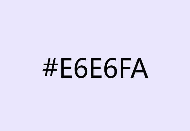
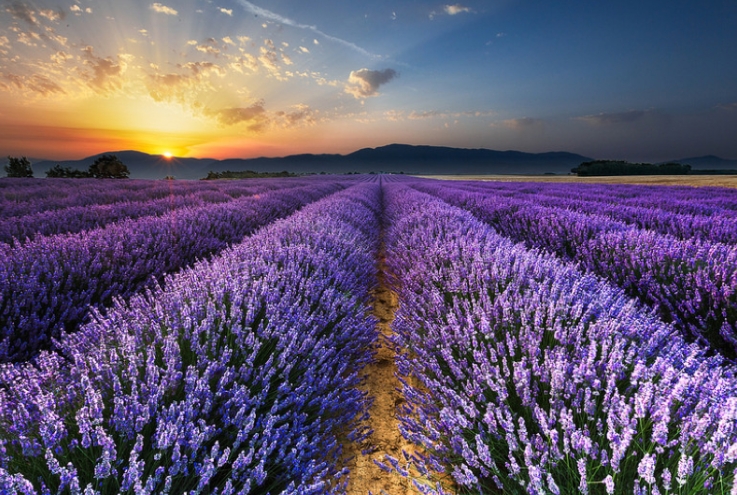
Lavender (color code: #E6E6FA) is a light, soft shade of purple with a slight blue undertone. Named after the lavender flower, this color exudes calmness and sophistication. It’s often described as a pale violet, offering a cool, serene quality that can enhance any design or artwork.

Lavender Color Code and Variations
Lavender’s exact hue can vary slightly depending on the context or medium. It typically lies on the cooler end of the spectrum, blending the stability of blue with the vibrant energy of red to create a balanced, peaceful shade.
Meaning and Symbolism of Lavender
Lavender is a color deeply rooted in symbolism. It’s often associated with femininity due to its delicate hue, but its meaning extends beyond that. Lavender represents calmness, purity, and spiritual awareness. In design, it evokes a sense of serenity and tranquility, making it ideal for spaces meant for relaxation or introspection.
Additionally, lavender is linked to nostalgia and romance, giving designs a soft, dreamy quality that can evoke emotions of wistfulness or whimsy.

How Lavender Differs from Lilac
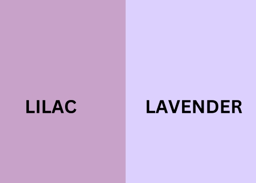
Lavender and lilac are often confused, but they are distinct colors with unique characteristics. While both are shades of purple, lilac leans more towards pink, giving it a warmer tone, whereas lavender has a cooler, bluish undertone. This difference in undertone affects the mood each color conveys—lilac is often seen as youthful and passionate, while lavender is more mature and sophisticated.

Colors That Complement Lavender
One of the most appealing aspects of lavender is its versatility. It pairs beautifully with a range of colors, each combination offering a different vibe. Here are some ideas for pairing lavender with other colors:
Cool Color Combinations
- Lavender and Light Blue: Creates a calm, harmonious atmosphere.
- Lavender and Mint Green: Offers a fresh, youthful aesthetic.
- Lavender and Gray: Perfect for a modern, chic look.

Warm Color Combinations
- Lavender and Peach: Evokes a sweet, romantic ambiance.
- Lavender and Coral: Adds a bold, vibrant contrast.
- Lavender and Mustard Yellow: Creates an eclectic, unique vibe.

Neutral Color Combinations
- Lavender and White: Provides a crisp, clean look.
- Lavender and Cream: Adds warmth and coziness.
- Lavender and Charcoal: Delivers a sophisticated, striking contrast.

How to Make Lavender Color in Digital Art
Creating the perfect lavender color in your digital art can greatly enhance your work’s visual appeal. Here’s how you can do it:
What You’ll Need:
- Digital art software (e.g., Adobe Photoshop, Procreate, GIMP)
- Basic understanding of color mixing and adjustment tools
Step 1: Start with Violet
Begin with a pure violet color as your base. This will serve as the foundation for creating lavender.
Step 2: Add White
To lighten the violet into a lavender shade, gradually mix in white. Be careful not to add too much, as it can wash out the vibrancy of the violet.
Step 3: Adjust the Hue
Fine-tune the hue by shifting it slightly towards blue. This adjustment will help you achieve the characteristic cool undertone of lavender.
Step 4: Experiment with Blue (Optional)
For a cooler lavender shade, add a touch of blue. Use this sparingly to avoid overpowering the violet.
Step 5: Fine-Tune Your Lavender
Adjust the lightness, saturation, and hue until you achieve the desired shade of lavender. Remember, small tweaks can make a big difference.
Conclusion
Mastering the creation of lavender in digital art can open up new avenues for your designs, adding an element of calm and elegance. Whether you’re using it as a primary color or a complement, understanding how to mix and match lavender effectively can elevate your creative projects.
By learning to create and apply lavender in your digital artwork, you’re not only enhancing your color palette but also infusing your work with the serene, sophisticated qualities that lavender embodies. So, embrace the magic of lavender and let it inspire your next masterpiece!


