When we think of pink, the images that come to mind are often linked to femininity, love, and sweetness. But when it comes to color theory, there’s an ongoing debate about whether pink is considered a warm or cool color. This colorful conundrum has sparked divided opinions, with some arguing that pink’s pastel tones make it a cool color, while others claim its association with red marks it as distinctly warm.
In this article, we’ll unravel the mystery and examine the arguments for both sides to help answer the question: is pink truly a warm color?
In this article, you will learn:
- What defines a warm color
- Is pink a warm color?
- Conclusion on the color debate around pink
What Defines a Warm Color?
In color theory, warm colors are typically hues that evoke feelings of energy, passion, and warmth. These colors include shades that fall in the red, orange, and yellow spectrum. Warm colors often feel comforting and lively, creating a sense of closeness or advancing toward the viewer when used in artwork or design.
Warm colors stand in contrast to cool colors, which are associated with blue, green, and purple. These cooler hues are perceived as calming, soothing, and often create a sense of distance or receding effect in a composition.
From a scientific standpoint, warm colors have longer wavelengths, which makes them appear more vibrant and stimulating to the human eye. This characteristic is why warm colors are often linked with energy, warmth, and intensity in various visual media.
Check out this YouTube video about color theory.
Is Pink a Warm Color?
Now that we understand what makes a color warm, let’s delve into the heated debate: is pink a warm color? There are compelling arguments on both sides, making it one of the more ambiguous shades in the color spectrum.
Arguments That Pink Is a Cool Color
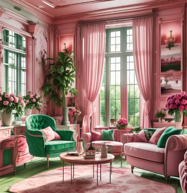
Many believe pink should be classified as a cool color because of its proximity to purple on the color wheel and its often pastel, muted tones. Pastel shades, by their nature, can have a cooling effect. Baby pink, blush, and other soft variations of pink are commonly used in spaces meant to feel calming and serene.
In interior design and fashion, pastel pinks are frequently paired with cool colors like mint green or sky blue to create a peaceful, tranquil atmosphere. Darker pinks like magenta and fuchsia, which lean toward purple, are sometimes seen as cool shades, further blurring the lines.

- In art and design, pastel pinks are often paired with icy blue or soft lavender to create cool, calming compositions.
- In fashion, soft pinks can be combined with silvery accents for a refined, cool-toned look.
- In interior design, pinks are sometimes used alongside cool tones to evoke balance and softness.
Arguments That Pink Is a Warm Color
On the flip side, many argue that pink is undeniably a warm color because of its close relationship to red. As a lighter version of red, pink carries many of the same warm characteristics, such as intensity, passion, and energy. The psychological impact of pink, associated with warmth, love, and affection, is another factor contributing to its classification as warm.
In color psychology, pink has a calming effect but still evokes feelings of warmth and comfort, especially when used in branding or advertising aimed at creating a cozy, affectionate ambiance. Moreover, saturated and vibrant shades of pink, like hot pink, often feel lively and energetic—much like their red counterparts.
Examples of Pink as a Warm Color:
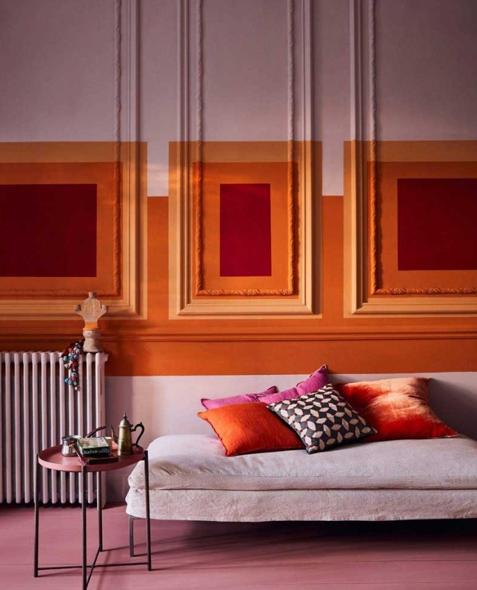
- In fashion, pink is often paired with warm shades like orange or yellow to create vibrant, energetic looks.
- In graphic design, pink is used to draw attention and evoke strong emotions, much like red.
- In art, vibrant pinks are used to express passion and bold emotions, often alongside other warm hues like red or orange.
Conclusion: Is Pink Really a Warm Color?
The debate over whether pink is warm or cool may never have a definitive answer. However, based on color theory and psychological effects, pink is generally considered a warm color. Its proximity to red on the color spectrum and its ability to evoke emotions of warmth and comfort tilt the balance in favor of it being warm.
That said, pink’s versatility allows it to be used as both warm and cool depending on the shade, context, and what colors it is paired with. While pastel pinks can lean toward cool, vibrant and saturated pinks are undeniably warm.
In the world of design and art, understanding the nuances of pink can help in creating the right atmosphere, whether you’re looking for a sense of tranquility or a burst of energy.

If you’re exploring color theory for your next creative project or redesigning your living space, Azilian LifeMotion can help you master color mixing and theory, giving you the perfect palette to work with.
The question of whether pink is a warm color might continue, but one thing is clear: pink’s ability to adapt makes it one of the most versatile colors in design.


